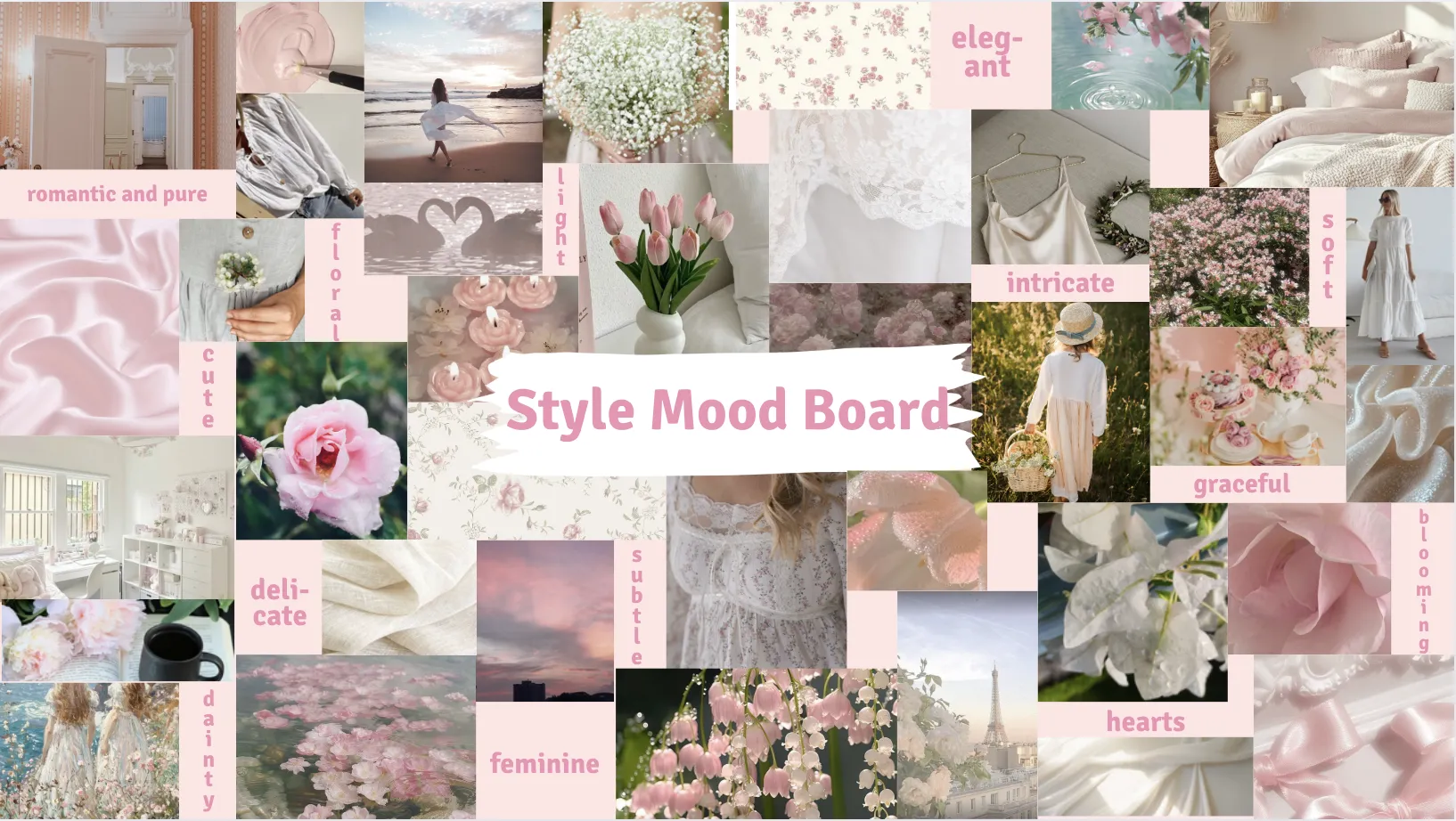
At the start of the design process, Lara struggled to come up with ideas. After researching for inspiration, she decided a floral logo would best reflect her personal style, using shades of pink, green and yellow, plus incorporating her initial.
She experimented with different fonts and flower shapes, then narrowed her ideas to three designs, which she drew and coloured on paper. The floral ‘L’ design was chosen for its colour palette and its reflection of Lara’s love of flowers and favourite colours. She transferred the design into Adobe Illustrator and refined it with the paintbrush tool to maintain detail while creating a cleaner digital version. The final logo represents Lara’s style and creativity, and the project was a valuable learning experience in designing and refining a personal brand.